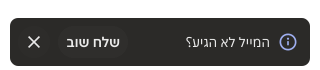
- Display only one toast at a time.
- Limit your message to 35 characters for a single-line toast or 90 characters for a multi-line toast.
- Be mindful of how often you trigger toasts.
- Use for short messages that confirm an action taken by a user.
Toast
A toast notification is a brief, non-intrusive message that appears on the screen to provide users with information or alerts.
Dos and Don'ts
- Don’t interrupt the user experience.
- Don't use toasts for critical information.
- Don't place the toast over any navigational elements.
- Don’t use Toast for error messages. See Error patterns docs for alternatives.
- Don’t overload with information, keep the messaging focused.
Anatomy
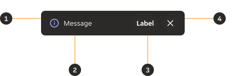
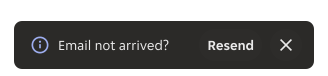
- Icon: Leading icon that visually supports the label.
- Message: Informs the user of the action they have performed.
- Action (optional): Button action to either dismiss the toast or to undo the action.
- Close (optional): Icon button to close the Toast.
Variants
Default
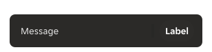
A default single-line toast; this can be used with or without an icon or action.
Multi-line
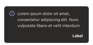
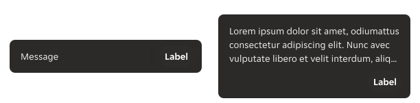
If you require additional text for your message, please use the multi-line component. Maximum of 3 lines.
Modifiers
Strong
Use strong colour variants to increase the visual impact of your message.

- Info: Providing contextual information about the progress of an action.
- Warning: Providing non-critical information about the progress of an action.
- Success: Providing positive information about the progress of an action.
- Error: Providing critical information about the progress of an action. Please review if toast is the correct component to use. It may be better to use a dialogue, notification or banner.
Subtle
To create a message with less prominence you can use the subtle variant.
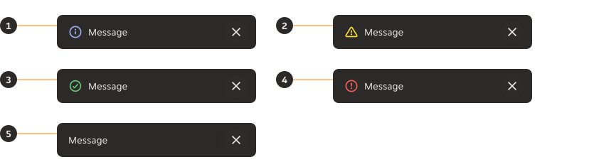
- Info: Providing contextual information about the progress of an action.
- Warning: Providing non-critical information about the progress of an action.
- Success: Providing positive information about the progress of an action.
- Error: Providing critical information about the progress of an action. Please review if toast is the correct component to use. It may be better to use a dialogue, notification or banner.
- Neutral: Neutral: Providing non-urgent general information about the progress of an action.
Icons
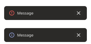
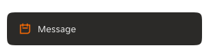
When using an icon inside the toast component, you should make sure that the icon clearly conveys the intended meaning. Only use the icons that have been built into the component - do not supply your own.
Actions
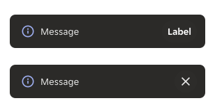
If you are using actions, only use the pre-built button in the toast.
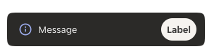
Sizes
Height
The toast has a minimum height of 48px when displaying one line of text. It should not exceed 122px in height, which is enough to accommodate up to three lines of text.
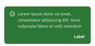
Width
The toast has a minimum width of 300px and a maximum width of 720px.
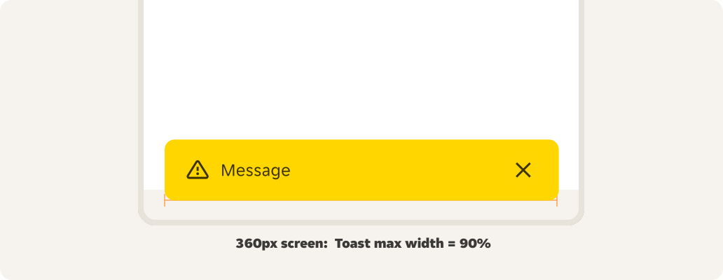
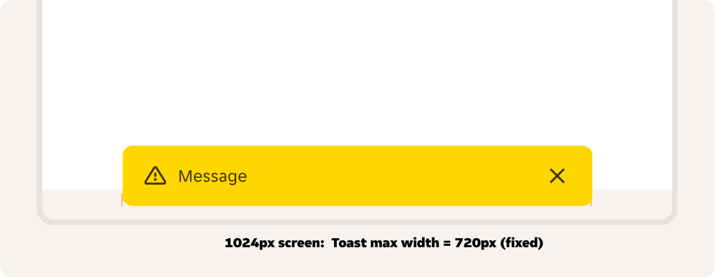
Overflow
If the body copy extends beyond one line, it should automatically wrap to multiple lines. Multi-line text will be truncated so that it does not exceed three lines. For longer text content, consider an alternative component.
Priority queue
Only one toast is displayed at a time. When toasts are consecutively or simultaneously triggered, their display order is defined by the priority queue.
Below it’s a reference for how a priority queue could be implemented by pillar engineers. Each level of priority takes over those below it, queues alongside toasts of the same priority, and yields to higher priority levels.
| Priority | Variant |
|---|---|
| 1 | Error - actionable |
| 2 | Error |
| 3 | Warning - actionable |
| 4 | Success - actionable |
| 5 | Info - actionable |
| 6 | Neutral - actionable |
| 7 | Warning |
| 8 | Success |
| 9 | Info |
| 10 | Neutral |
Behaviours
Auto-dismiss
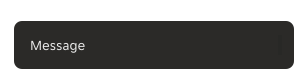
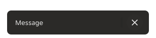
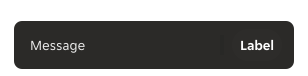
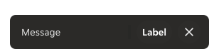
By default the toast automatically disappears after 5 seconds. However, the user can manually dismiss the toast before the timer ends if a close option is present. Additionally, users can pause the auto-dismissal by hovering over the toast, with the timer resetting once the mouse moves away.
Persistent
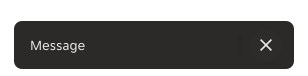
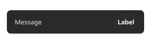
If the toast has a close icon button or a dismiss button, the toast can be persisted until the user manually dismisses it.
Interactions
If the toast includes either a close icon button or a dismiss button, either can be used to dismiss the toast.
Touch area
| Element | Platform | Touch area |
|---|---|---|
| Close button | Android | 48px x 48px |
| Action button | Android | [width of button] x 48dp |
| Close button | iOS | 44px x 44px |
| Action button | iOS | [width of button] x 44px |
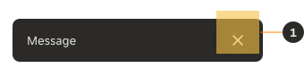
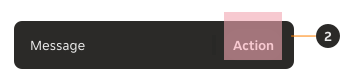
- Close icon button: Target area to close the toast by clicking on the close button.
- Action button: Target area that leads to an action configuration which consequently dismisses the toast.
Layout
Content area
The content area is determined by the fixed content on the screen, such as Navigation Menu and Home Indicator Bar.
Full screen
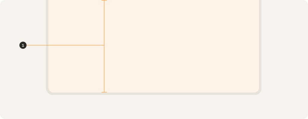
- Full screen content area.
Docked bottom navigation
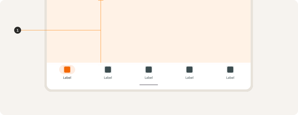
- Content area in relation to the docked bottom navigation.
Floating bottom navigation
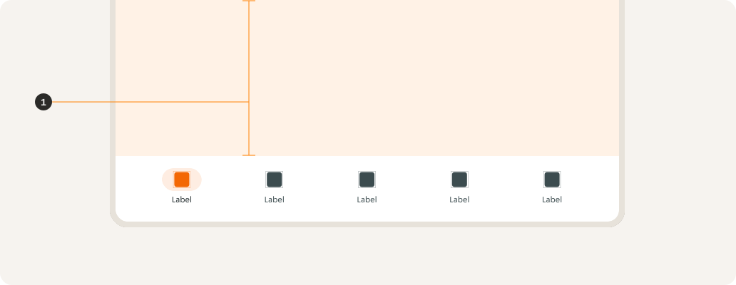
- Content area in relation to the floating bottom navigation.
Home indicator
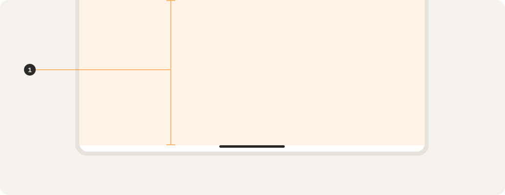
- Content area in relation to the home indicator.
Positioning
The toast should always be positioned at the bottom centre of the mobile and tablet screens and to avoid the bottom navigation bar and a pinned footer. The bottom of the toast should be 24px from the base of the content area.
No fixed content
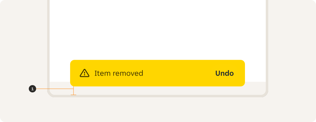
- 24px from the base of the toast.
Bottom navigation
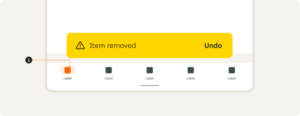
- 24px from the base of the bottom navigation.
Floating navigation
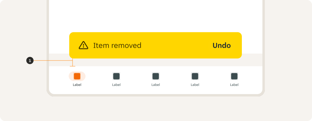
- 24px from the base of the toast in relation to the floating navigation.
Home indicator
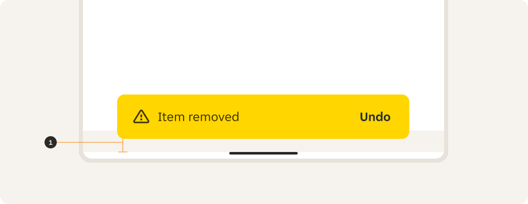
- 24px from the base of the toast in relation to the home indicator.
Examples
LTR examples
Here are some examples of the toast component in a left-to-right context:
RTL examples
Here are some examples of the toast component in a right-to-left context: