Cookie Banner
Cookie banner allows users to accept or reject cookies which are not essential to making your service work.
Overview
The purpose of the cookie banner is to inform users about the use of cookies, obtain their consent, and customise their preferences.
It aids websites in complying with privacy regulations by offering transparency regarding data collection practices and empowering users to control their privacy settings.

Anatomy

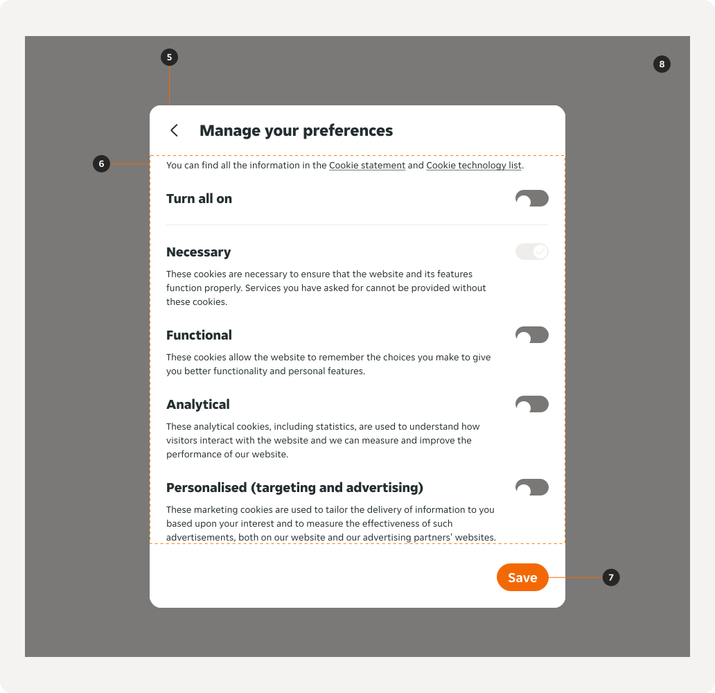
- Banner: Contains the content.
- Title: Provides context to the Banner.
- Body copy: Provides supporting context to the user.
- Call to actions: Allow the user to proceed with multiple options.
- Modal: A closeable window that overlays a page.
- Content: Provides information for the user about the cookie preference options available.
- “Save” button: Allows the user to save their preferences and continue with their flow.
- Scrim: Screen overlay that obscures the on-page content.
Variants
Banner

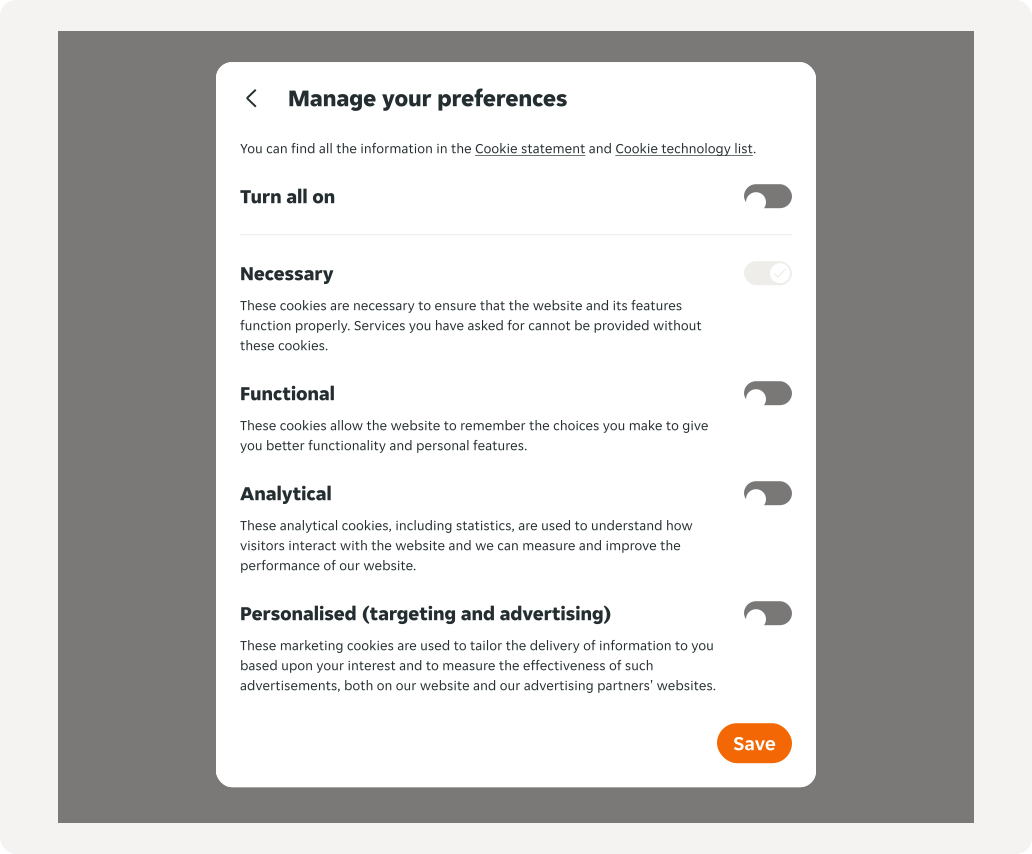
Modal
Modifiers
Banner
Default

Primary actions only
This version is used when legal compliance in the country requires you to do so. In countries that do not require this, the default variation is used.

Interaction area
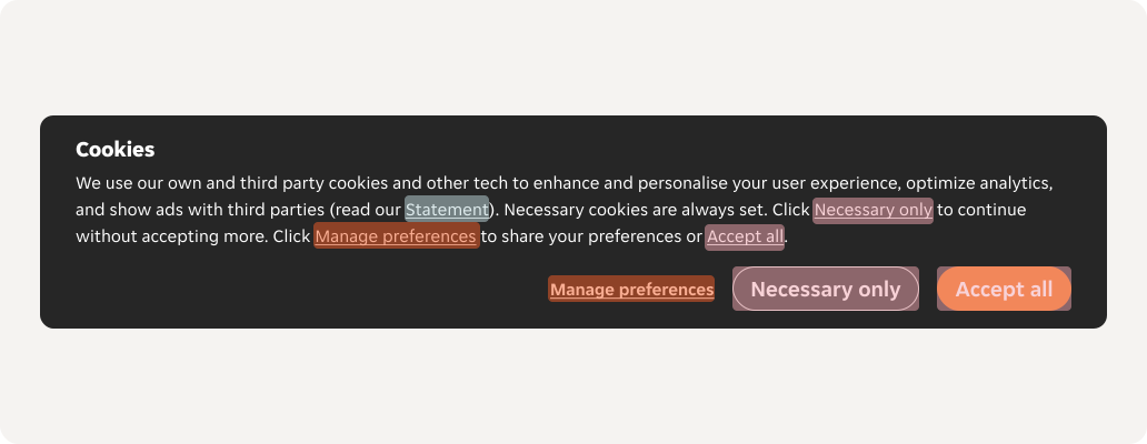

- Redirect: Redirects the user to the page they have selected in a new tab, the cookie banner will continue to show until the user makes a selection.
- Confirm selection: Saves the user's selection and closes the modal and cookie banner.
- Opens a “Manage preferences” modal: A modal will open to allow the user to manage their preferences.
- Toggle on/off: Allows the user to toggle selections on or off.
- Back button: Closes the modal and shows the cookie banner again.
Content
Behaviours
Banner background
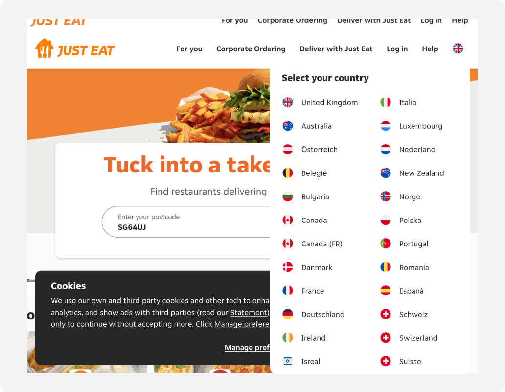
The background page of the cookie banner isn’t disabled, and is only disabled once the modal is opened. The “Select your country” popover from the top navigation should sit on top of the banner so that the users can change the locale.
Modal background
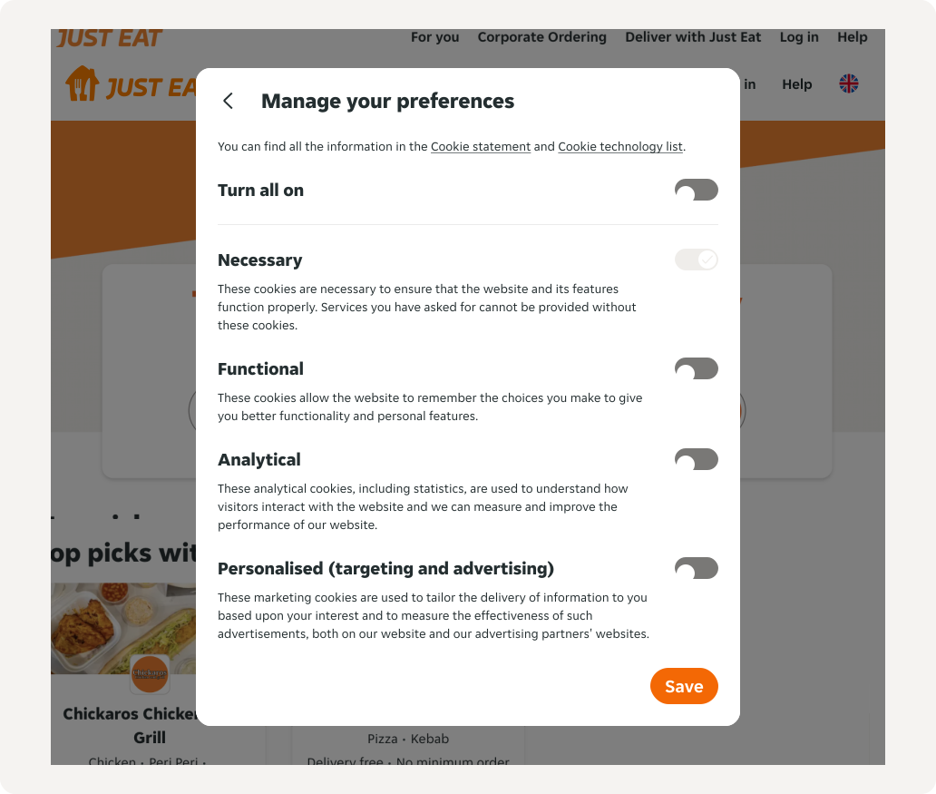
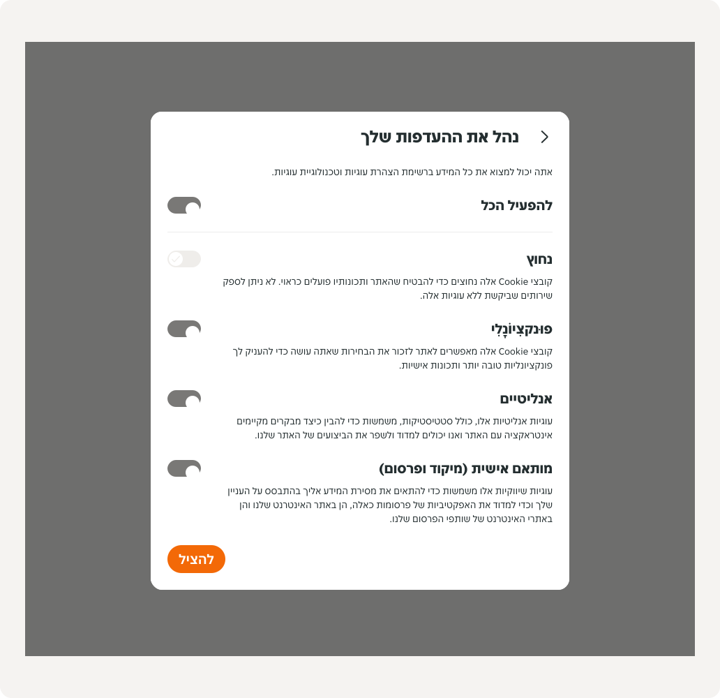
The background page is disabled when the modal is opened until the user has made a selection and is ready to continue with their flow, or returns to the banner. A scrim is applied and the banner disappears.
Turn all on / off
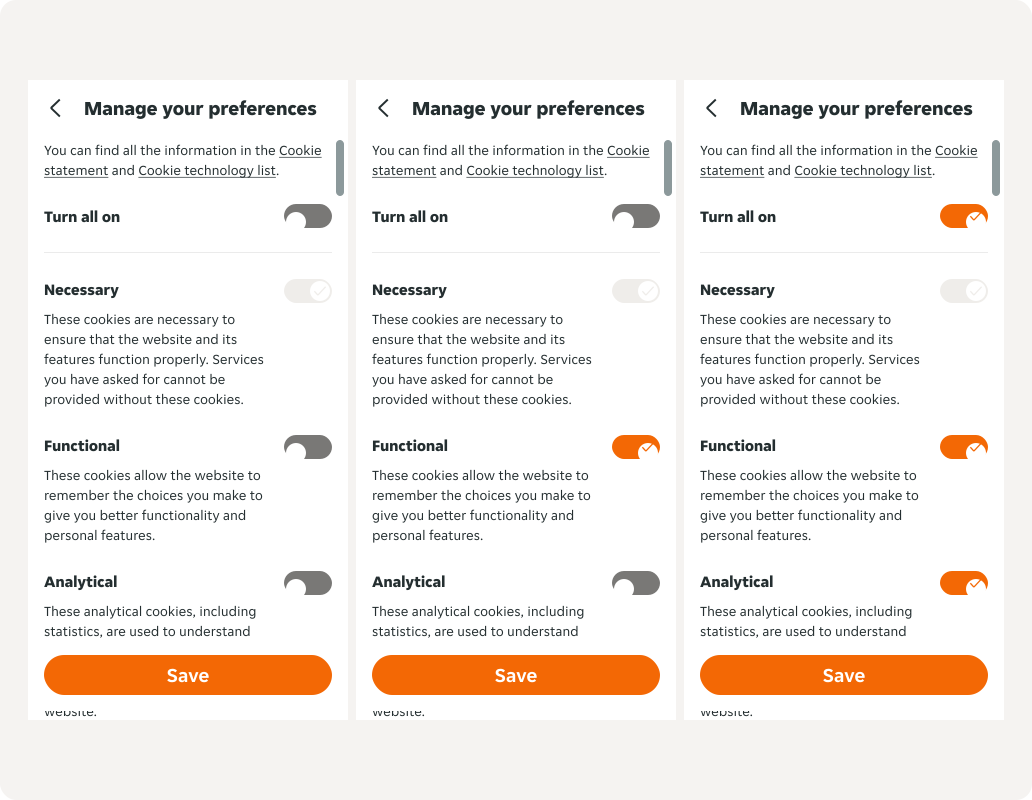
Once the overarching toggle is toggled on/off, the child toggles follow suit. The overarching toggle will not be toggled on unless all child toggles are selected.
Size
Wide width
The wide cookie banner has a minimum width of 700px and a maximum width of 1024px.

Narrow width
The narrow cookie banner has a minimum width of 320px and a maximum width of 699px.
Positioning
Banner positioning
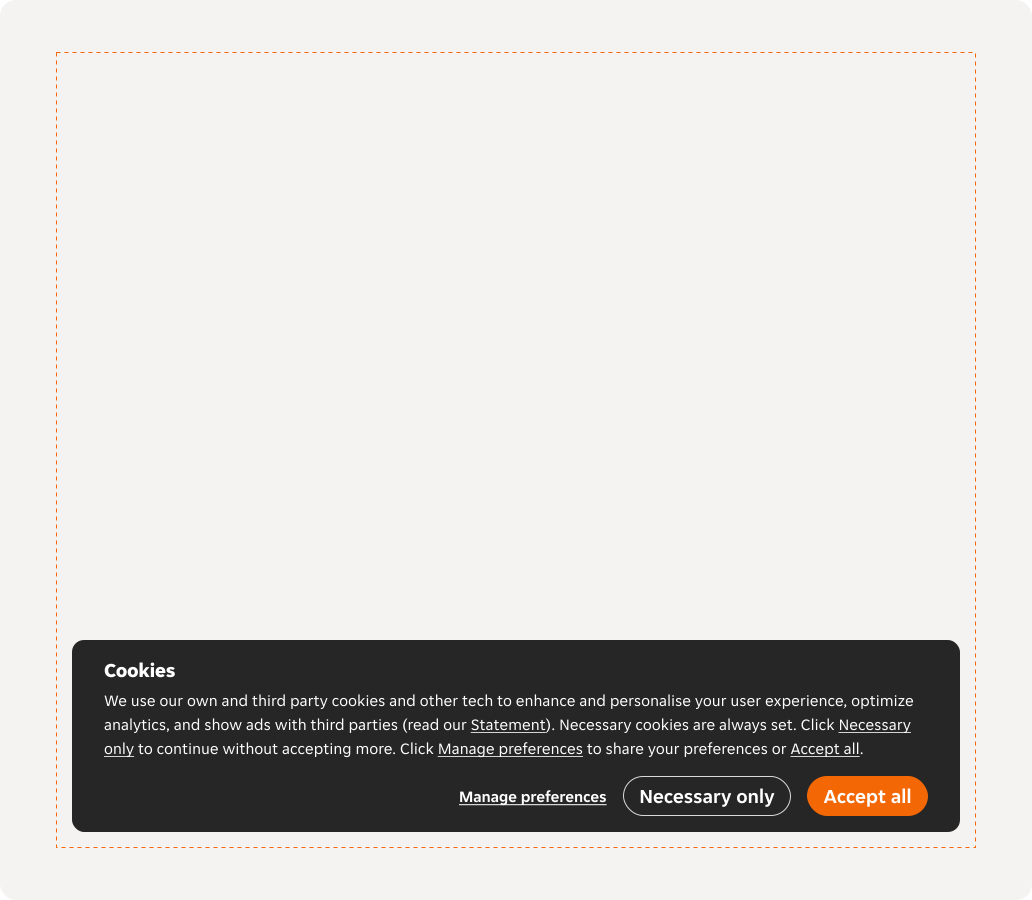
The cookie banner is always positioned at the bottom of the screen with default bottom, left and right padding of 16px from the container of the banner.
Modal positioning
The modal is positioned in the centre of the screen with a scrim applied.

Motion
Banner
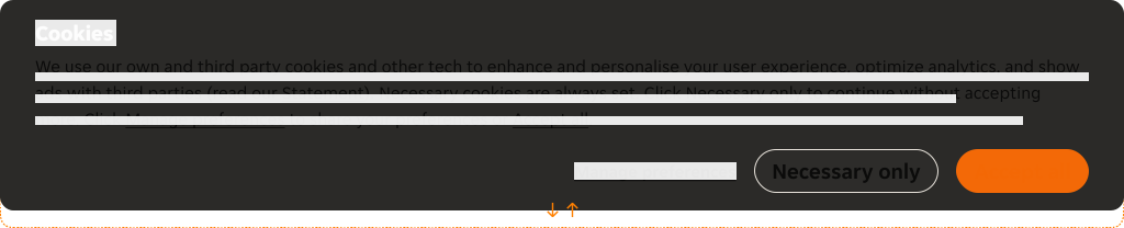
Illustrates the movement taking place when the cookie banner enters and exit from view. You can see an animated example in our drive.
Enter transition
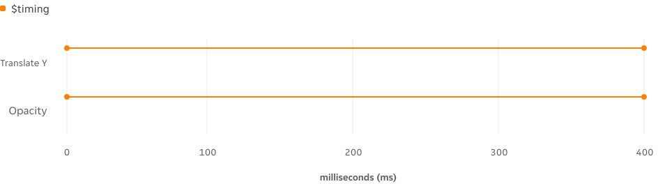
As the cookie banner enters the view, it ascends by 75% of the component’s height over 400 milliseconds from its final position, simultaneously fading into view without any delay.
| Property | Cubic Bezier | Easing token | Notes |
|---|---|---|---|
| Translate Y | (.45, 0, .55, 1) | $easing-functional | Moves up 16px from point of origin at 400ms |
| Opacity | (.45, 0, .55, 1) | $easing-functional | Cookie banner gently fades into view at 400ms |
Exit transition
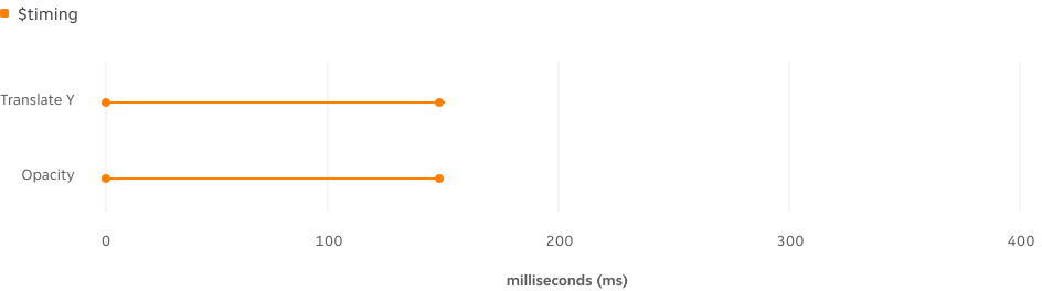
When the cookie banner exits from view it moves down 75% of the component’s height at 150ms from the final position. At the same time it fades out of view. Exit transitions are always quicker than entry.
| Property | Cubic Bezier | Easing token | Notes |
|---|---|---|---|
| Translate Y | (.45, 0, .55, 1) | $easing-functional | Moves down 4px towards point of origin at 150ms |
| Opacity | (.45, 0, .55, 1) | $easing-functional | Cookie banner gently fades out at 150ms |
Modal
Overlapping transitions
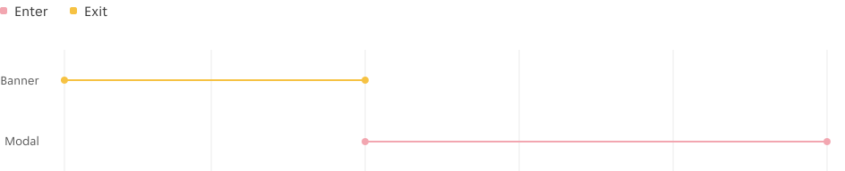
As the pattern consists of two components, the transition between the banner exiting and the modal entering should overlap, ensuring a smooth and seamless transition.
Examples LTR
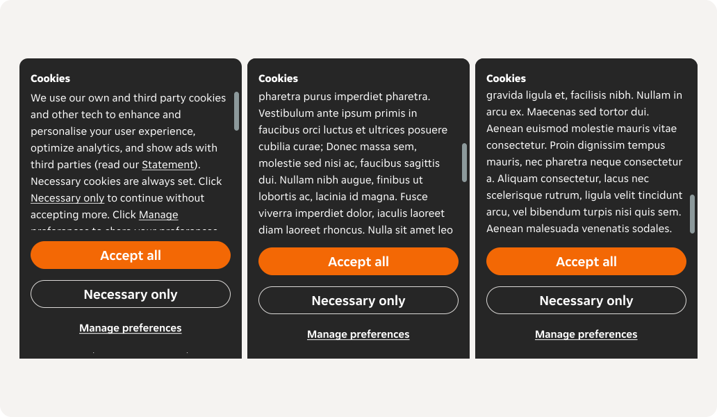
Narrow (left-to-right)
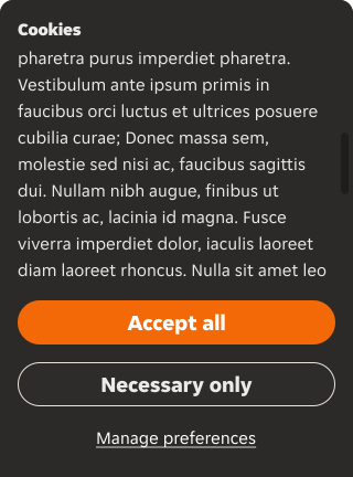
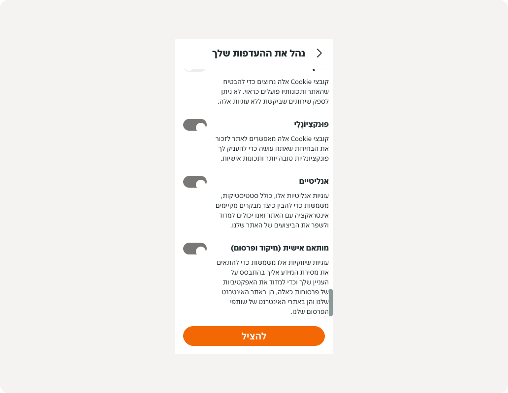
At the narrow breakpoints, the banner has a maximum height of 432px, and the modal is set to full screen. If the content overflows due to a change in language, the available height, the call to action buttons and header become sticky and the body content scrolls.
Banner
Modal

Examples RTL
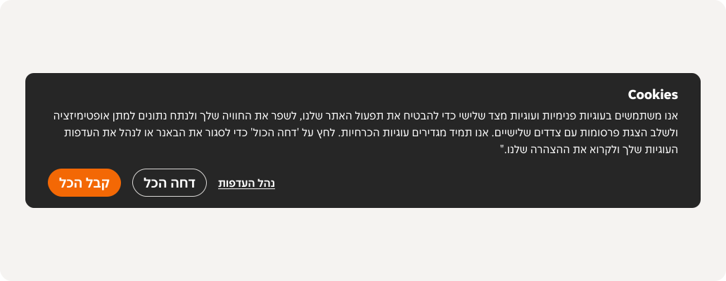
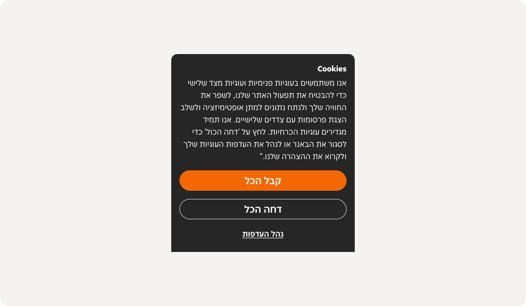
For languages that read right-to-left, the layout and alignment of the content is reorganised so the readability of the component makes logical sense.
Wide
Narrow
Resources
| | |
| | |
| | |
| | |
| | |
 Vue [Fozzie] Vue [Fozzie] | |
 React [Snacks] React [Snacks] | |
 iOS JustUI [UI Kit] iOS JustUI [UI Kit] | |
 iOS PIE [SwiftUI] iOS PIE [SwiftUI] | |
 Android PIE [Compose & Views] Android PIE [Compose & Views] | |

