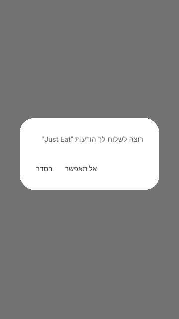
- Use them for alerting users about critical information or errors.
- Use them for displaying system-wide messages about critical information or errors.
Modal - Native
A system native modal that displays critical notifications, or messages within an app, adhering to platform design guidelines.
Dos and Don'ts
- Displaying system-wide notifications or messages.
- Don't use Modal-native components for anything other than system prompted notifications. For other types of messages use the custom Modal (Dialog) instead.
Anatomy
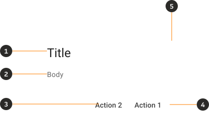
- Title: Concise heading for clarity.
- Body: The main message or information.
- Action 1: Main action for user interaction.
- Action 2 (Optional): Secondary action option.
- Background: Bounding box for the dialog's content.
Modifiers
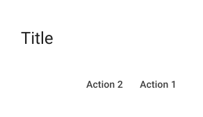
No body
You can use a native dialog with no body for quick confirmation messages, alerts, notifications or confirmation prompts where the title alone is enough.
Interactions
Closing the dialog
Tapping outside the dialog's boundaries will close it, providing an intuitive way to dismiss it without interacting with specific UI elements like calls to action (unless that is otherwise specified by the interaction).
Content
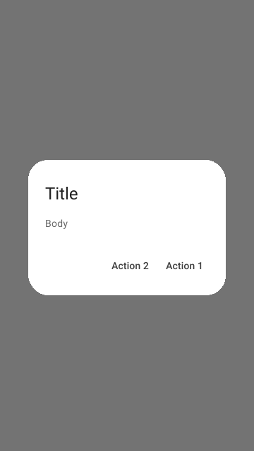
Title
- Ensure the content follows platform specific wording
Body
- Ensure the content follows platform specific wording
Calls to action
- Ensure the content follows platform specific wording
Examples
LTR examples
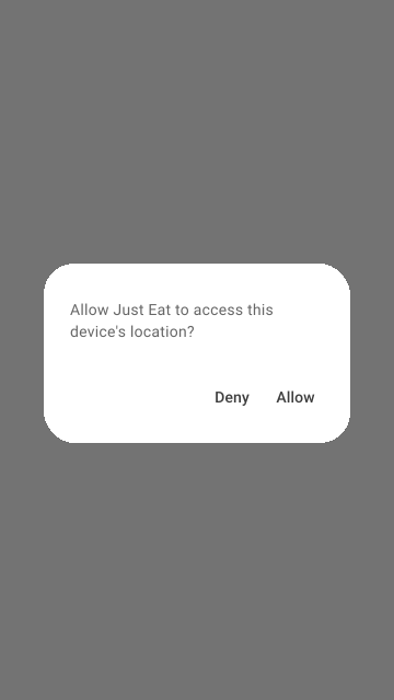
Here's an example of a Dialog in the LTR context:
RTL Examples
Here's an example of a Dialog in the RTL context: