- Use to organise related information.
- Use to shorten pages and reduce scrolling when content isn't crucial to read in full.
Accordion
An accordion is an interactive element that organises and displays content in a collapsible and expandable way.
Dos and Don'ts
- Don't use if the quantity of the content within the Accordion is too large, consider Tabs instead.
Anatomy
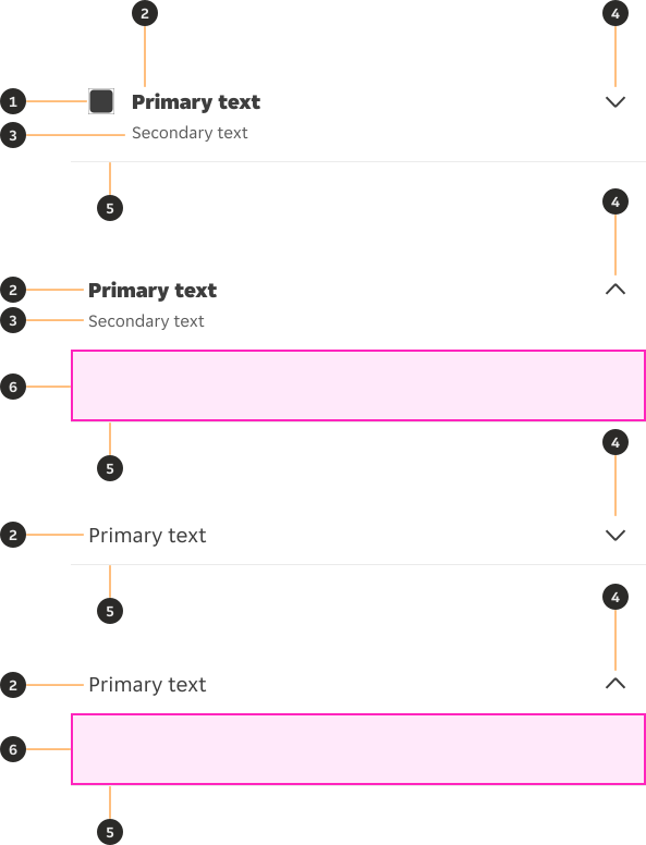
- Icon (Optional): Non-interactive icon that can be used to visually support the primary text.
- Primary Text: Informs the user the type of content contained within the Accordion.
- Secondary Text (Optional): Provides additional detail if required, aiming to be contained within two lines.
- Chevron: Indicates whether the Accordion is open or closed.
- Divider (Optional): Helps visually defining the end of a list item and the beginning of the next one.
- Slot: Allows for adding content directly into the component.
Variants
Default

Modifiers
Leading icon
When incorporating an icon into an Accordion, it is essential to ensure that the icon clearly connects to the content of the Accordion, helping reinforce the Accordion's purpose.



Secondary text
Used for Accordions that require an additional secondary line of information to provide clarity to the user.

Divider
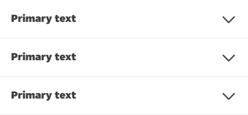
By default the divider is used, with the exception of the last Accordion in a stack to signify the end of the section.
Expanded content
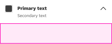
The accordion component includes a content slot in its expanded variant, allowing designers to insert their own content directly into the component. For guidance on working with slots in Figma, please refer to the Figma Slot Guidance.
Emphasis on primary text
Prominent
Used when the category title needs to be prominent on the page.

Low emphasis
Used when the category title doesn't need to be highly prominent.

Behaviours
States
The Accordion has states, collapsed and expanded. The chevron pinned right of the Accordion indicates which state it is in. The chevron points down to indicate collapsed, and up to indicate expanded.
Accordions, by default are collapsed with all content panels closed. Starting in the collapsed state allows the user a high level overview of the available information.

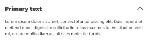
Multiple accordions open at once
Accordions expand independently allowing multiple Accordions to be open at once.
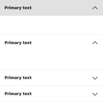
Overflow
When the content is too long to fit in one line, both the Primary and Secondary text should wrap into a new line.
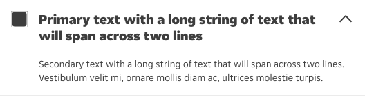
Interactions
The whole container is interactive to expand or collapse the Accordion.

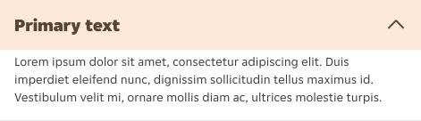
Overrides
Padding
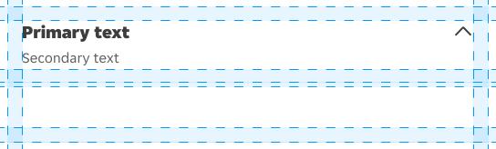
The accordion component supports padding overrides on both the trigger (the top bar containing the title and toggle icon) and the content slot (the expanded area below). Both can be adjusted independently to suit layout requirements.
Corner radius
The corner radius of the accordion can be overridden to align with the surrounding layout or surface it is placed on.

Content
- Keep primary text concise and focused, ensuring it remains clear and descriptive enough to communicate the intended message.
- Use sentence-style capitalisation (only the first word in a phrase and any proper nouns capitalised).
- Don't use lengthy or complex text for primary text; keep labels concise and scannable.
- Don't use title case or all caps capitalisation for labels or descriptions.
Interactive States
Outlines the atomic level interactive elements for the component.


Examples
LTR Examples
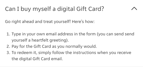
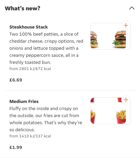
Here are some examples of Accordions in LTR context:
RTL Examples
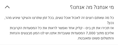
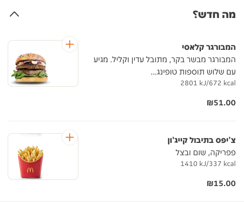
Here are some examples of Accordions in RTL context:
Accessibility
Text scaling
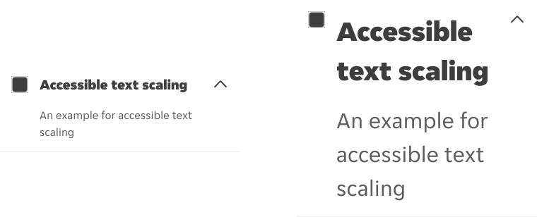
When a user activates the accessible text scaling options on their device, both the primary and secondary text should scale (and wrap into a new line if needed) to accommodate the new text size.
Zoom
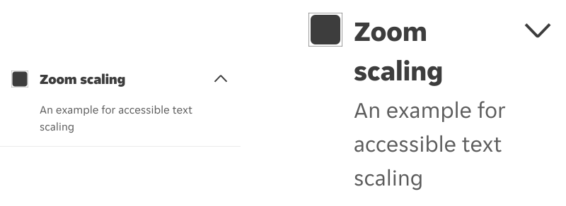
If the user zooms their screen up to at least 200%, all items in the component should scale accordingly.
Screen reader support
iOS
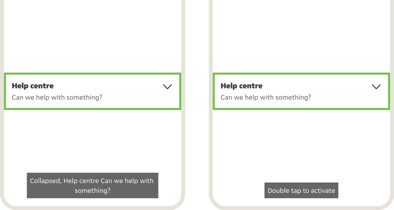
Name: Primary text Trait: N/A Type: N/A Available actions: Expand, Collapse
Android
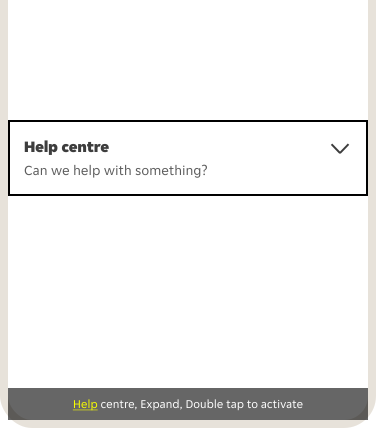
State: Expanded, Collapsed Content description: Primary text, Secondary text Type: N/A Actions: Double tap to activate